Coinbax Brand Guide
Our visual identity is built on three principles: radical minimalism, functional design, and technical precision.
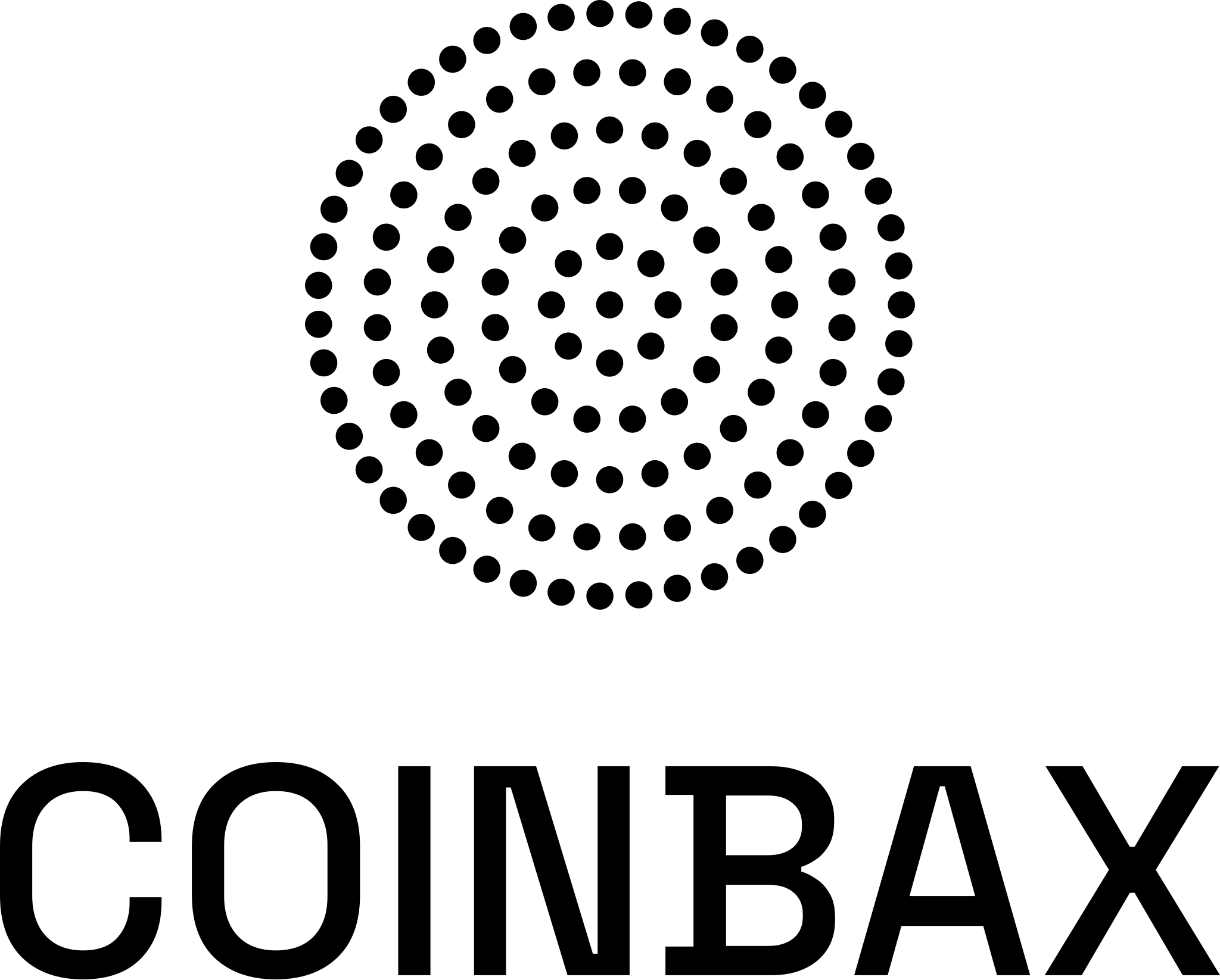
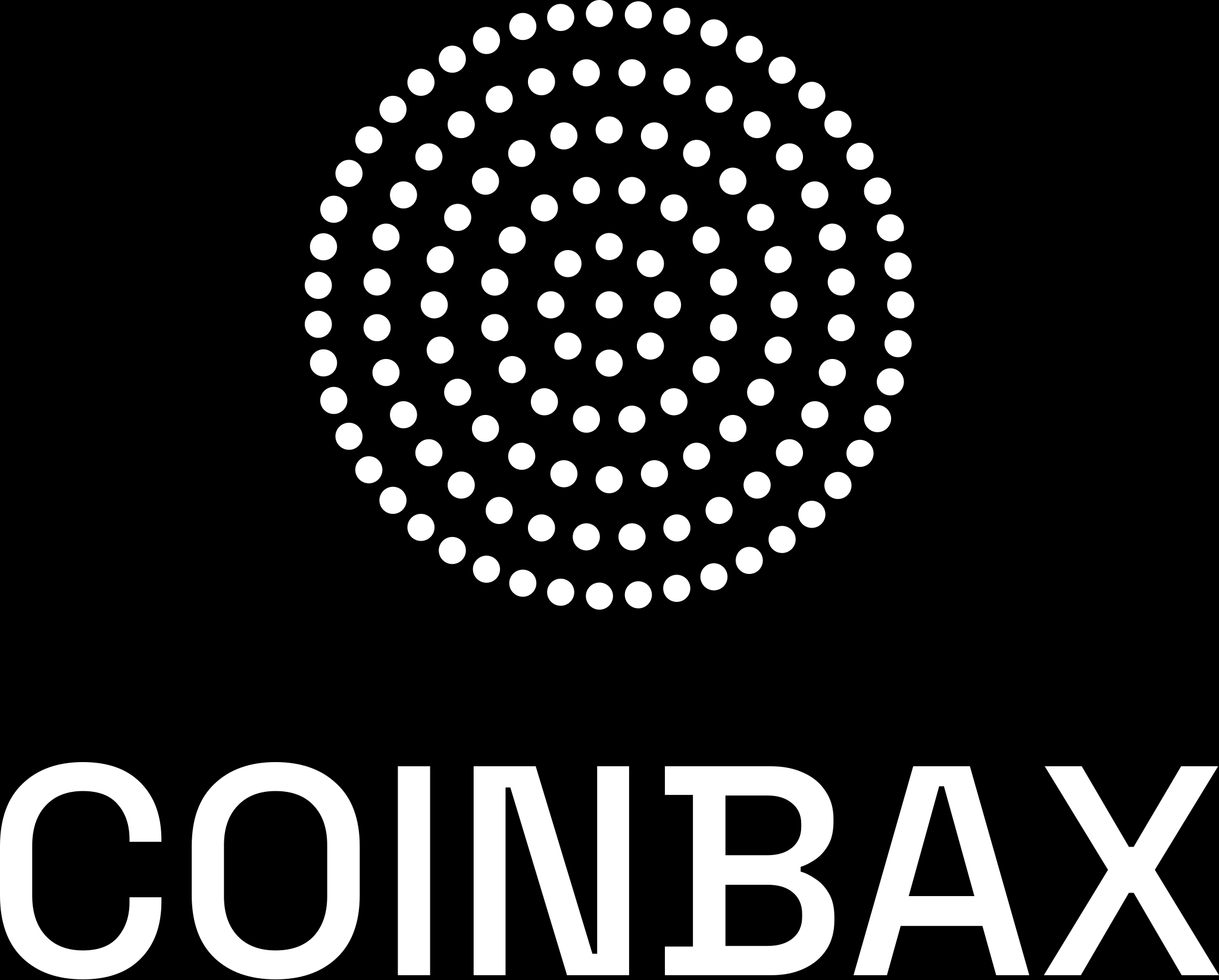
The 128-Dot Logo
Our mark is a circle of 128 dots. This number is not arbitrary—it represents the 128-bit encryption standard that forms the backbone of modern cryptography.
The circular arrangement suggests completeness, trust, and the continuous nature of secure payment flows. Each dot represents a point of verification, a checkpoint in the cryptographic process.
Usage: The 128-dot circle can stand alone as an icon or appear with the COINBAX wordmark. Always use white dots on dark backgrounds and black dots on light backgrounds.
Logo Downloads
Each logo is available in three types — stacked, horizontal, and wordmark — in both black and white, on white, black, or transparent backgrounds. SVGs are vector (infinite scale); PNGs are high resolution for print and presentations.
Stacked Logo


Horizontal Logo


Wordmark Only


Typography
IBM Plex Mono — Primary Typeface
Nearly all text uses IBM Plex Mono. This includes body copy, navigation, form fields, labels, and UI elements. The monospace aesthetic creates technical precision and sets us apart.
THE CHALLENGE
Coinbax adds a layer of safety and control to stablecoin and tokenized deposit payments — combining instant settlement with programmable escrow, reversibility, and built-in compliance.
Space Grotesk — Headlines Only
Space Grotesk is reserved for large headlines and card titles. This creates clear hierarchy while maintaining the monospace-dominant aesthetic.
The trust layer for stablecoin payments
Dot System
Simple Dots — Not Icons
We use simple 8px dots throughout the interface. No complex iconography, no illustrations. Just dots—tying directly back to the 128-dot logo.
Default
White/Black
Processing
Orange
Complete
Green
Color
98% Monochrome
The design is overwhelmingly black, white, and shades of gray. Color appears sparingly and only when it serves a functional purpose.
2% Functional Color
Orange
#ff5705
Primary actions, buttons, active states
Green
#00ff88
Success indicators, completion states
Additional colors available but rarely used: Blue (#05adff) for informational elements, Yellow (#ffd905) for warnings, Red (#ff0557) for errors, Purple (#ad05ff) for special accents.
Flow Diagrams
Boxes, Arrows, Dots
Workflow diagrams use simple bordered boxes connected by arrows (→). Dots indicate state: orange for processing, green for completion.
1
SENDER
Initiates
2
COINBAX
Escrow
3
RECIPIENT
Receives
Buttons & Forms
Buttons
Orange for primary actions. Black/white borders for secondary actions. IBM Plex Mono uppercase with letter-spacing.
Form Elements
All form inputs use IBM Plex Mono. Clean borders, minimal styling. Dropdowns over complex selectors for space efficiency.
Design Principles
Radical Minimalism
Strip away everything non-essential. Every element serves a purpose. No decoration for decoration's sake.
Functional Color
Color communicates meaning, not decoration. Orange = action. Green = success. Everything else = monochrome.
Technical Precision
Monospace typography, geometric forms, exact specifications. Design that respects technical users and financial professionals.